Trending

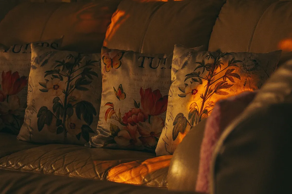
Few changes to a room pay off as quickly as a new arrangement of cushions. No drilling, no paint, no waiting in for a delivery — just ten minutes and a sofa that suddenly looks considered rather than accidental. The catch is that cushions are also the easiest thing to get wrong. Too many of the same size, patterns that compete, an accent colour that has arrived from nowhere and is standing awkwardly by the door. Stylists are not working from a secret formula. They work from four things: size, colour ratio, pattern scale and placement. Get those right and you can rearrange a living room on a Sunday afternoon and be pleased with it.
Most people buy cushions in the same size because that is what the shop had on the shelf. The result is a row of identical squares that looks like a waiting room. An arrangement works when the eye has something to compare, so mix at least two sizes — three is better — and keep the total number odd where you can. Five cushions on a three-seat sofa will look more relaxed than six.
These are the sizes worth knowing:
One practical note: buy the inner pad a size larger than the cover. A 50 cm cover needs a 55 cm pad. It sounds fussy, it costs nothing extra, and it is the difference between a cushion that looks plump and one that droops.
Matching cushions exactly to a sofa makes a room look flat. Working in proportions gives you far more freedom. The old interior standby is 60/30/10, and it translates neatly to cushions.
Roughly 60 per cent of what you see should be the calm base — the sofa itself and the plainest cushions. 30 per cent is your secondary colour: a soft contrast, perhaps a deeper version of the base or a complementary neutral. The final 10 per cent is the accent, and this is where you can have some fun.
The trick with the accent is repetition. If you introduce a rust cushion, let a similar rust appear somewhere else in the room — a book spine, a ceramic pot, the frame of a print. One cushion on its own can look like a mistake; the same colour twice looks deliberate.
A green velvet sofa does not need four more green cushions. Go tonal instead: two shades lighter and one darker, all in the same family, with a plain linen cushion or two to let the tones breathe. The same approach works for deep navy, mustard and terracotta.
Pattern mixing usually fails for one reason: everything is the same size. Three medium florals on one sofa will look busy however tasteful each one is on its own.
Think in three scales. One large pattern — a big leafy print, a wide stripe. One medium — a small check or a simple geometric. One small — a fine dot, a delicate motif, or a woven texture that reads as pattern from a distance. Then give them a shared colour. A single thread of the same ochre, green or blue running through all three prints will hold the group together even when the motifs have nothing else in common.
A pattern recipe that rarely fails:
Keep the plain cushions at the front and the patterned ones behind, or the sofa will start to shout.
A 55 cm plain square at the back, a 50 cm patterned square in front of it, and a 30 x 50 cm rectangle laid across the front, angled with one corner pointing towards the arm.
Two 50 cm squares, one at each end, each with a matching rectangle in front. Crisp and ordered, and very good on a sofa with a strong shape or a busy room behind it.
On a corner sofa, ignore the middle. Group three cushions at each end — large square, medium square, rectangle — and leave the long stretch bare. The empty space is what makes it look styled.
One generous cushion, or one rectangle, on a small armchair or bench. Nothing else. It looks confident and costs the least.
Colour and pattern are what people notice; texture is what makes a room feel considered. A group of cushions in three different fabrics will always look richer than five in the same weave.
Useful combinations: smooth velvet with rough linen, chunky wool with fine cotton, bouclé with a flat weave. Mixing matte and sheen matters too — a little silkiness next to something dry gives the arrangement depth without adding another colour.
Swap fabrics with the season if you like. Wool and velvet in autumn and winter; linen, cotton and lighter weaves from spring. Covers are cheaper than cushions, and rotating them stops a room going stale.
Once everything is on the sofa, step back and take one cushion away. If it looks better, leave it off. Most arrangements improve when a cushion is removed, and it is usually the one you added last.
Then do three things: push each cushion into the corner it belongs to rather than spacing them evenly, rotate the rectangles so their corners point in different directions, and plump everything. A cushion that has been squashed against an arm for a week will show it.
If you have more cushions than places to put them, store the spares. Rotating two or three sets across the year gives you far more variety than leaving all of them out at once.
Photograph your sofa in daylight and look at the picture on your phone before you shop. It is easier to judge colour from a screen than from memory, and it stops you coming home with a fourth beige cushion.
Then run through the basics: two or three sizes, an odd number of cushions, a 60/30/10 colour split, patterns at three different scales, and at least two textures. That is the whole method. Everything else — the exact print, the precise shade — is taste, and taste is allowed to change.
Photo: Rattakarn_ / Pixabay